MaestroQA
WebApp
CLIENT DURATION MY ROLE
MaestroQA 1 Week User Research, UX Design, UI Design
Method
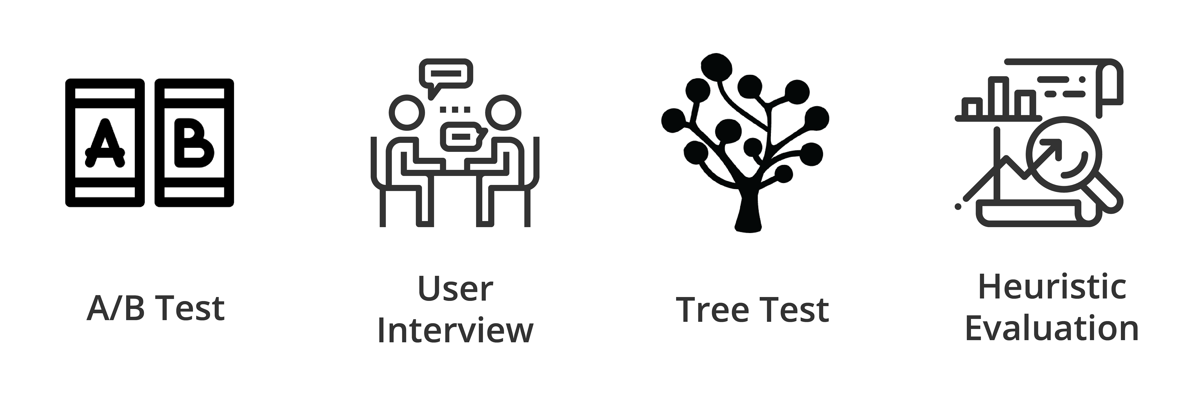
A/B Testing, User Interviews, Tree Test, Heuristics Analysis, Low Fidelity Wireframes
Tools
Adobe Illustrator, Adobe Photoshop, Sketching
Overview
MaestroQA is a web application that customer service quality assurance software helps managers help agents to construct good customer experiences. I did a design challenge to improve on their color system and information architecture for the web app.
Problem
How might we help managers to overview the performance of agents at a glance?
Design Process
Stakeholder Request
The stakeholders of MaestroQA had 3 requests:
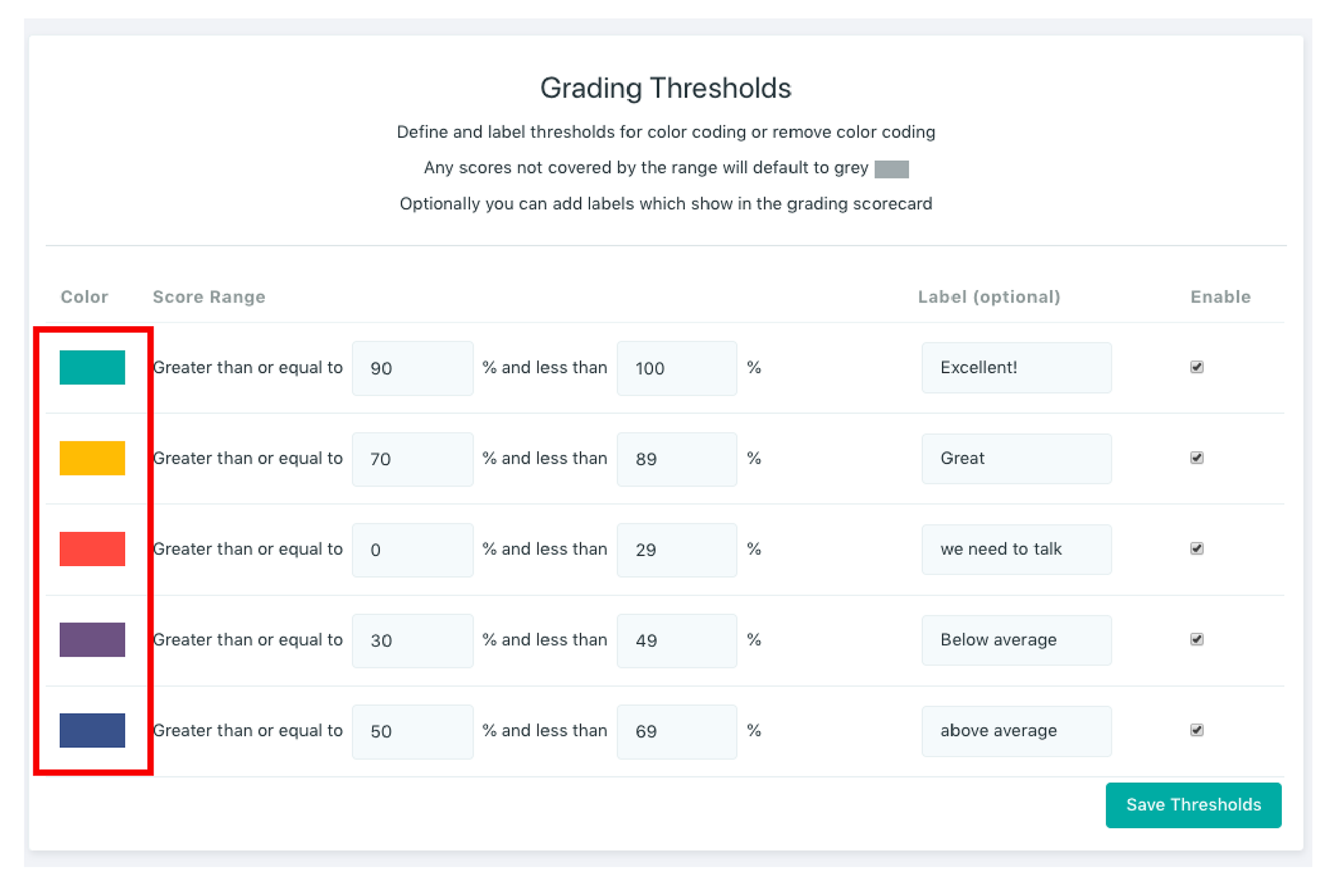
● R1. There is only 1 threshold. We want to allow different thresholds across different rubrics.
● R2. This feature(the threshold) is not well known. Make this feature more naturally discoverable for users.
● R3. Fix any other glaring issues location is needed for volunteering.
R1. Different thresholds across different rubrics
1. First Impression
Based on MaestroQA’s explanation, when peer A is giving a color grade to peer B, they tend to give a non-offensive color to maintain a friendly environment.
Senior agents and newbie agents have a different perspective; therefore different versions of threshold are needed to meet their requirements.
Also, these colors are used in three different pages: ”Reporting”, “Tickets”, and “Coaching”.
The current version of "Thresholds" page that needs to be updated.
2. Hypothesis
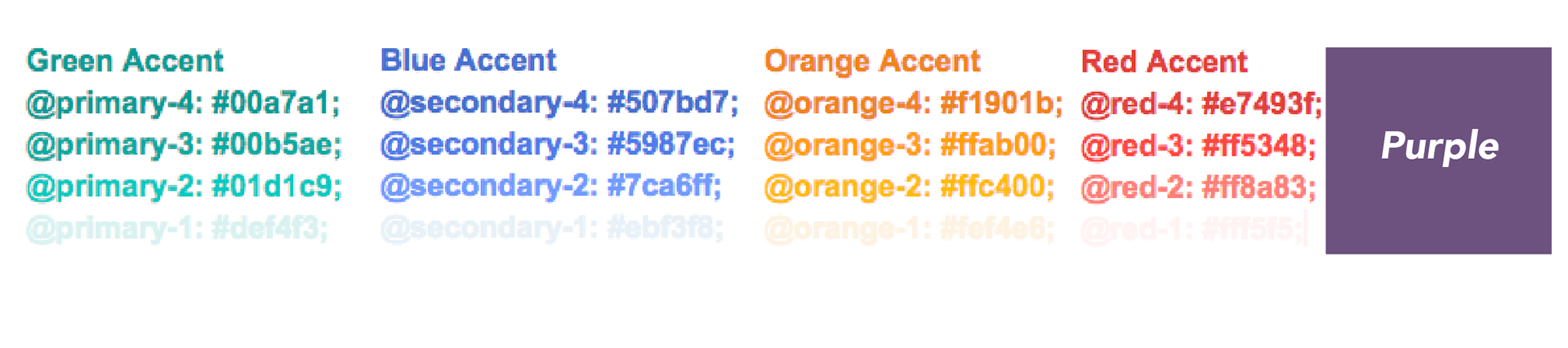
MaestroQA's main 5 colors
Although these 5 colors are used in ”Reporting”, “Tickets”, and ”Coaching”, their meanings are different in each page. This inconsistency in color definition across the 3 pages might confuse users.
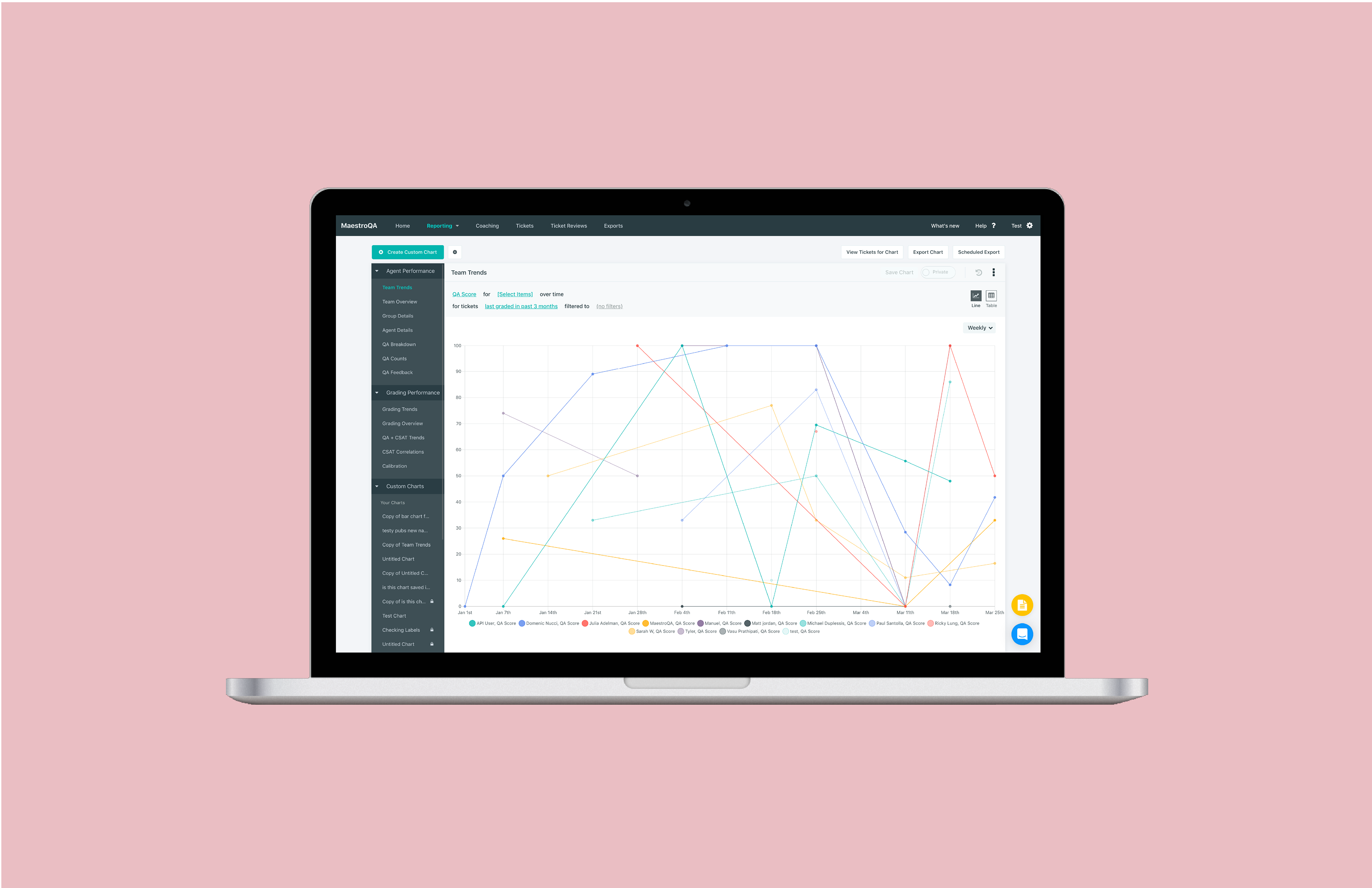
Previous "Reporting" page
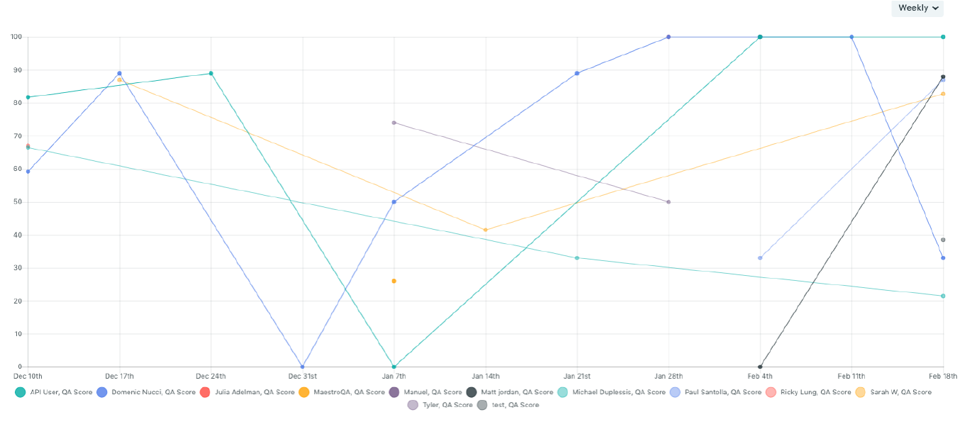
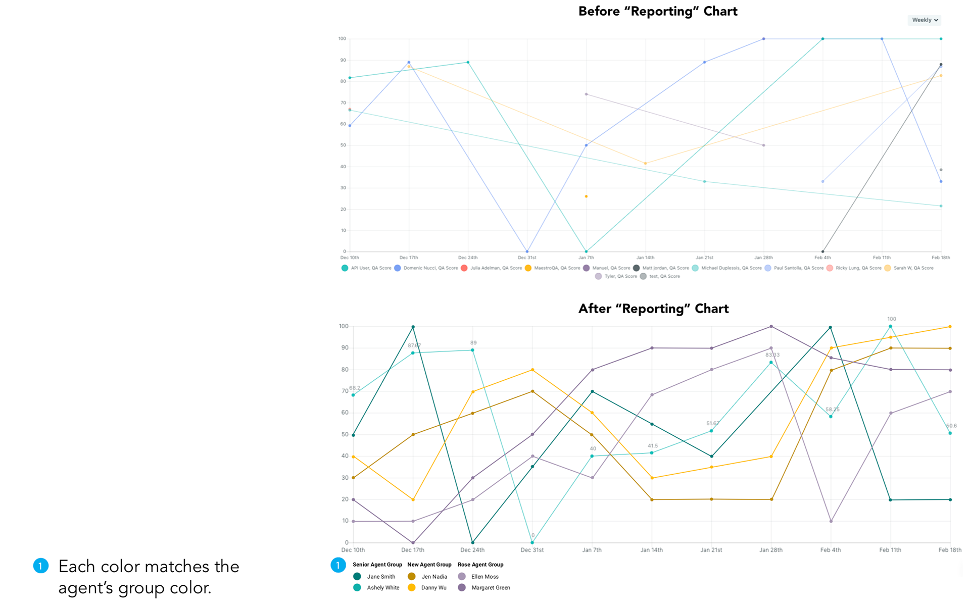
On “Reporting”, each color represents a single agent. It is to overview how an agent or the whole team is doing in a specific time range.
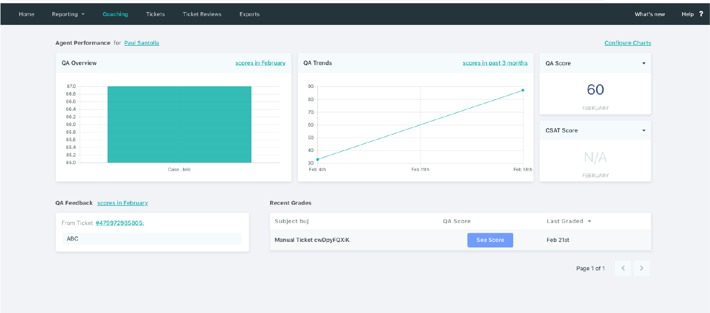
Current "Coaching" page
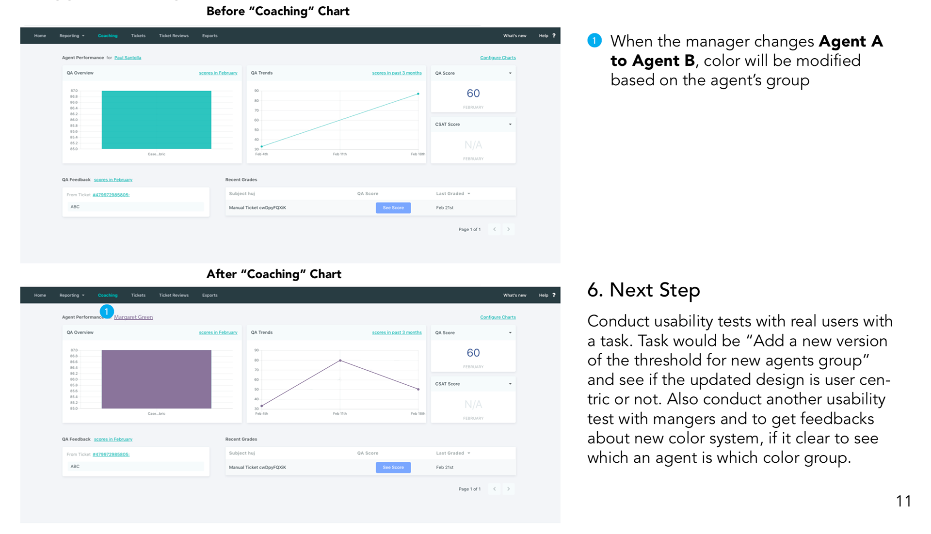
On “Coaching”, there is only one color, primary color green, to show all the graphics and to represent an agent. Even if you change an agent to another agent, the color stays the same.

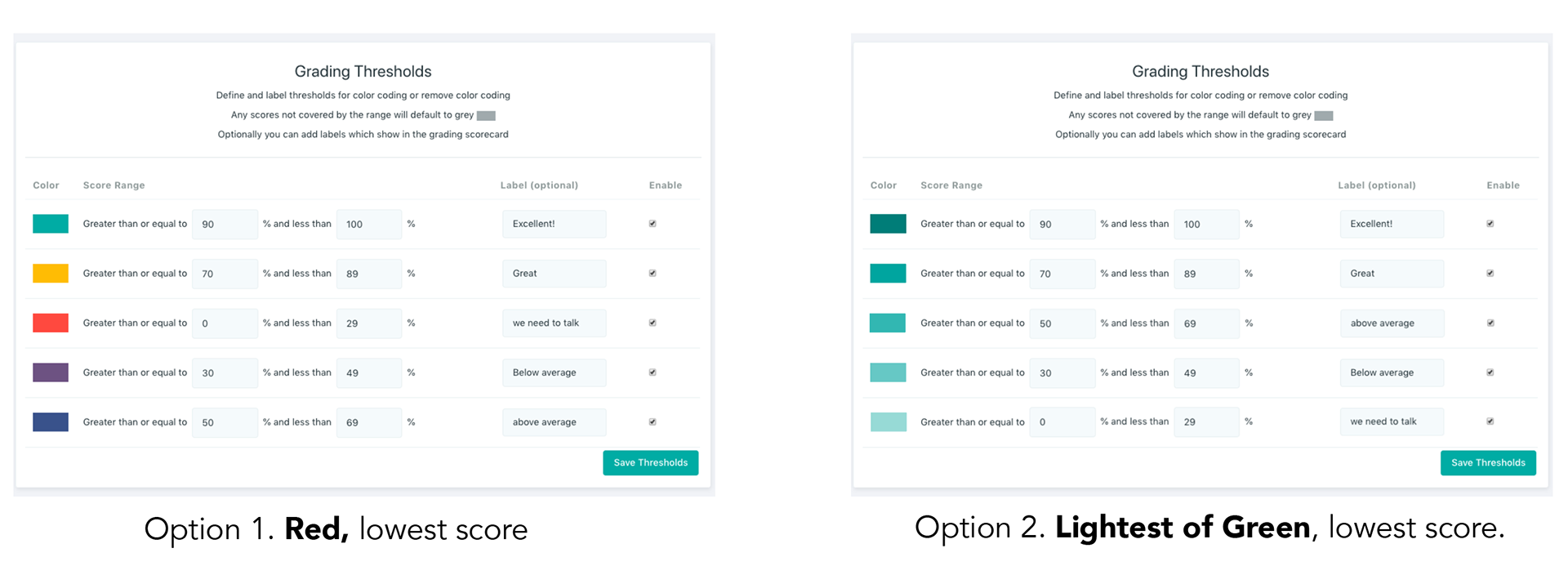
Current "Grading Thresholds" page
Lastly, on “Grading Threshold”, all five colors represent a certain grade of an agent’s performance
My Hypothesis

My Suggested "Grading Threshold" page
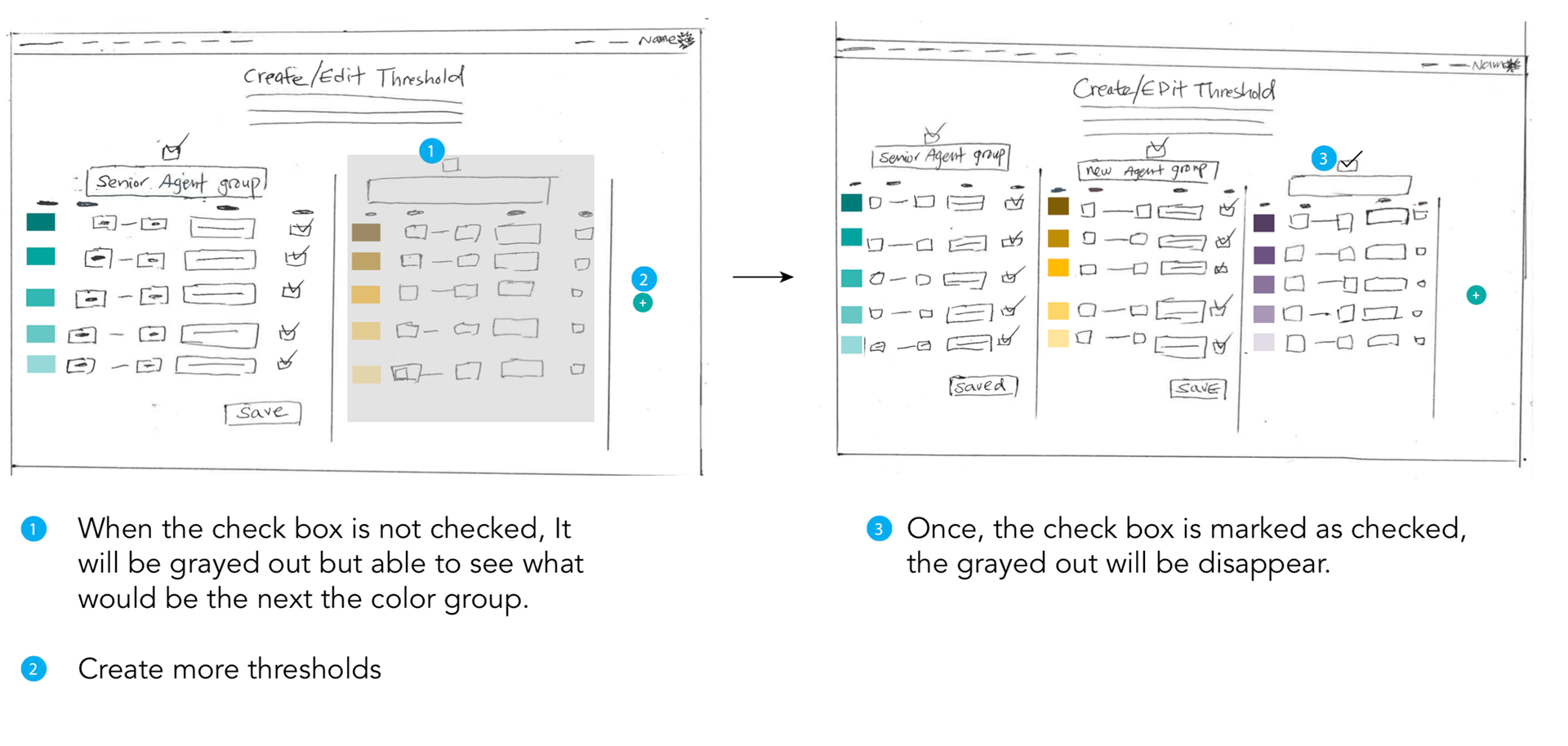
In order to keep a consistent color representation, we can assign a color by agent group, which means we can create up to five different agent groups by color.
For Grading Threshold, we can use the gradient of one color to represent the grades. For example, darkest color can be the highest score and lightest color means the lowest score.
3. A/B Test
In order to figure out if my hypothesis was correct, I conducted A/B tests, A/B test is a randomized experiment with two variants, A and B. It includes the application of statistical hypothesis testing or "two-sample hypothesis testing" as used in the field of statistics
Scenario : You are part of a positive energy team. Your team is known for growth mindset. You are used to give feedback to each other. Your company just ordered a subscription of a web application, which allows you to give and receive feedback from each other. One of your peers just graded your work that you are not proud of. You already know that you are getting the lowest score.
Task: If you were receiving the lowest score color, what color would you prefer?
4. A/B Test Result
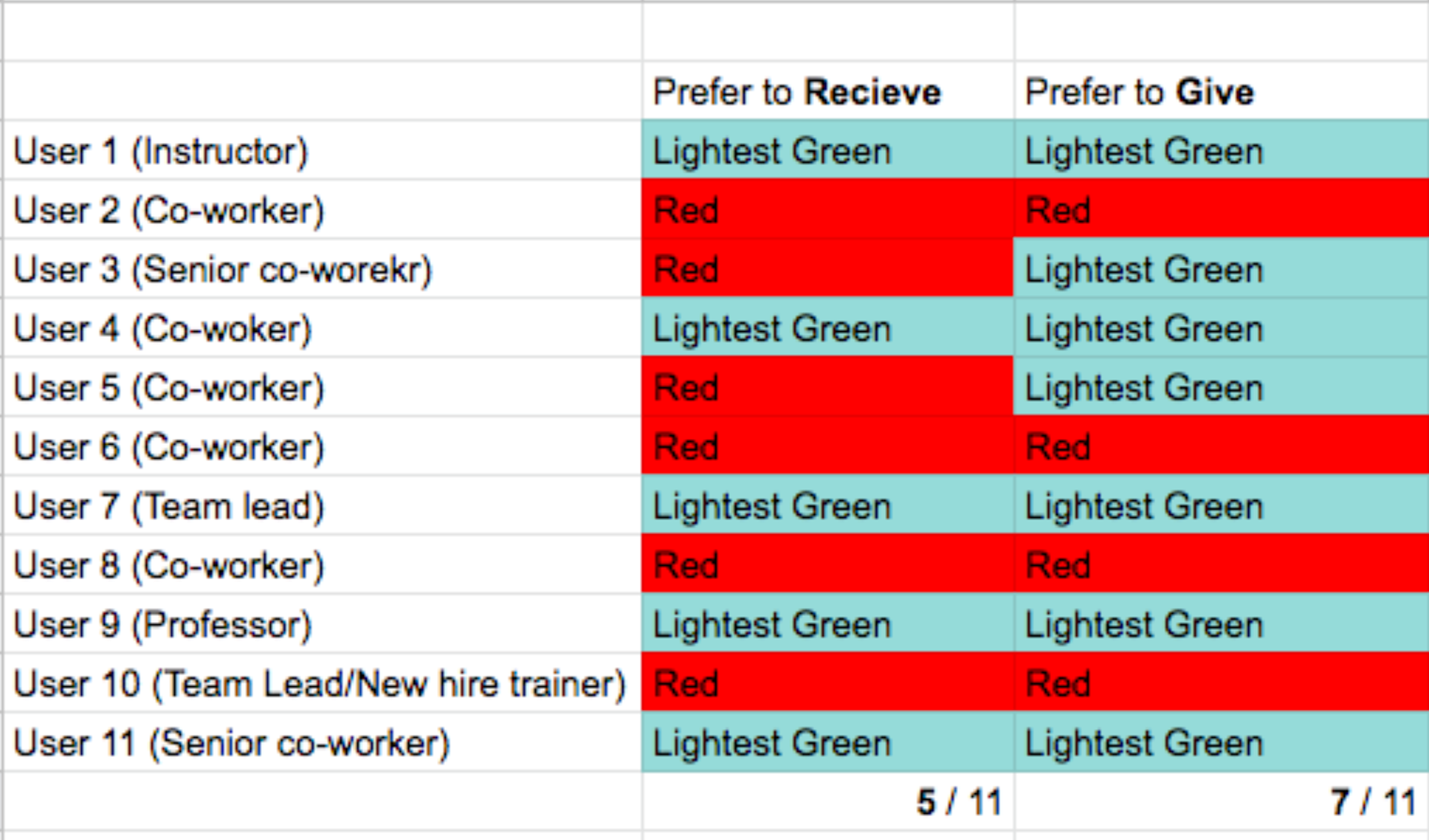
I conducted the A/B test on color options “Grading Threshold” with 11 participants. Before I started the A/B test, I made sure that the participants have given and received feedback in the professional work environment.
As you can see from the chart,
5/11 People would prefer to receive Lightest Green color.
5/11 People would prefer to receive Lightest Green color.
6/11 People would prefer to receive Red color.
However,
7/11 People would prefer to give Lightest Green to coworkers because it feels less offensive.
5/11 People would prefer to receive the Lightest Green color because:
·Gradient shows ranges of work ethic
·Easy to distinguish progression because of darkness to lightness
·Less emotionally aggressive
·Easy to distinguish progression because of darkness to lightness
·Less emotionally aggressive
6/11 People would prefer to receive Red because:
· Red is known for failing
· Efficiently knows the situation at a glance
· Efficiently knows the situation at a glance
However, 7/11 People would prefer to give Lightest Green to coworkers because:
· It is less offensive and also the color represents that there is a room for improvement, rather than notifying the coworkers' bad performance.
· It is less offensive and also the color represents that there is a room for improvement, rather than notifying the coworkers' bad performance.
5. Suggestion
Even though 6/11 people preferred to receive the color red, 7/11 people would prefer to give the lightest green because they would like to keep a friendly working environment. Moreover, once we use a certain gradient as a specific group color, the color code can be consistent throughout the pages; we are organizing the color system throughout the web app. For example, Green gradient group can represent senior agents and Orange gradient group can represent freelance agents. With these color codes, it would be easier for the managers to oversee how each group is doing in “Reporting”. On “Coaching”, if you changed the agents, the color will also change based on the group. This will allow managers to glance and see if the agent is a senior or freelancer based on a specific color.
R2. This feature(the threshold) is not well known. Make this feature more naturally discoverable for users.
1. First Impression
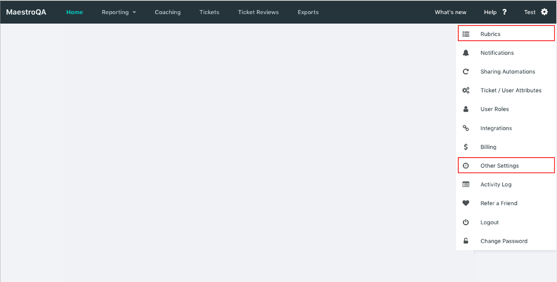
When I initially looked at the MaestroQA web application, I saw that there is room for improvement in information architecture. With the limited time that I had, I focused on the “Rubric” page and the “Other Settings” (Grading Threshold) page.
2. Hypothesis
“Other Settings (Grading Threshold)” is not well known because the name of the page and the name of the button do not match and users might think that they are not the same. Secondly, it might be located where users are not expecting on a website.
In order to figure out if my hypothesis was correct, I conducted a tree test, a technique to evaluate the findability of topics in a website/web application, with 11 participants. I chose these 11 people who are used to working in a team setting and are used to giving feedback to his or her team members.
3. Tree Test
In my hypothesis, it made sense to me to put “Rubric” and “Grading Threshold” as a tertiary page of “Ticket” because it is where graders or managers would grade. It would also be convenient to edit the rubric and the threshold on the same page but my hypothesis was incorrect, based on the result.

4. Result
The first task was “You would like to create the rubric ( Rubrics are grading scorecards for quality assurance. Create and update rubrics used to grade any ticket or agent on your team). Where do you think you will find it?”
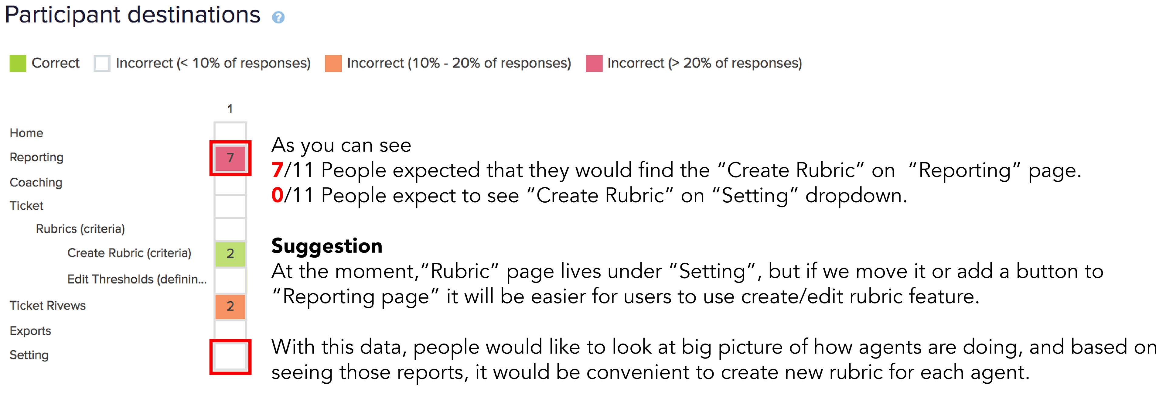
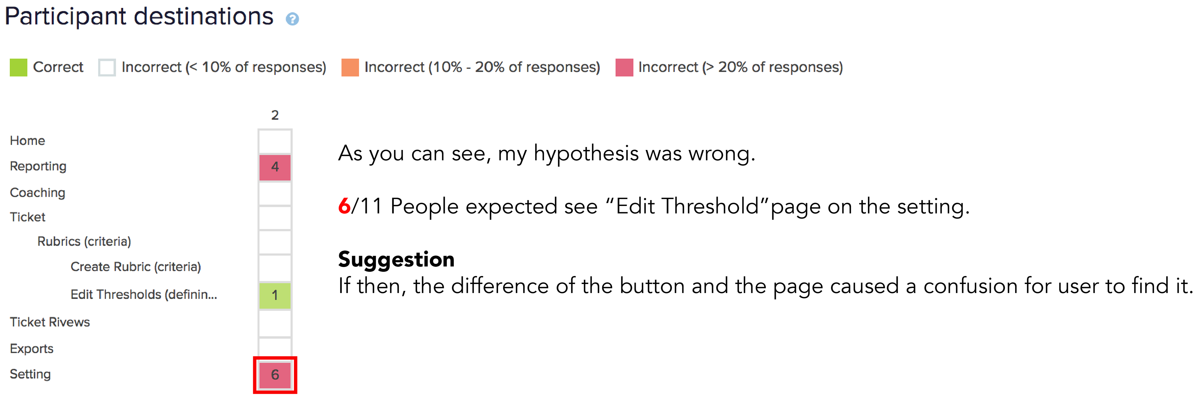
The second task was “You would like to edit the Thresholds, where would you find it?”
See more detail about the result via https://www.optimalworkshop.com/treejack/r044exwn/x1qm066r/shared-results/c30ew7zx2t02p34h7324maxp76tam21k
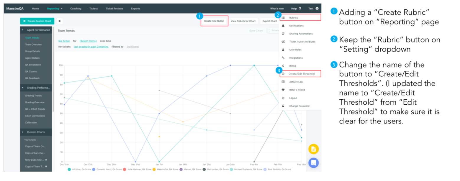
5. Suggested Design Solution
6. Next Step
Conduct usability tests with real users with a task. To make sure that updated information architecture is helping the users to create a new rubric or creating/editing thresholds. (Also to find it if “Create/Edit Threshold” is more clear than “Edit Threshold”